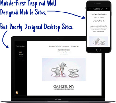
Jewelry Websites That Are Beyond Responsive
We get it. You have heard a lot about responsive jewelry website design and you want to make sure that the website you'd get from us is responsive.
The quick answer is yes—but no—and there's a reason why. The jewelry website templates and themes shown on our design page are technically dynamic serving jewelry website designs with responsive elements that adjust to different size desktop and tablet screens while maintaining a solid and extremely user friendly smartphone design.
The owners of Jeweler Websites, Inc. started building websites in 1994 and expanded into mobile sites in 2001. You could say we have a bit more experience than anyone else you've spoken to.

In the beginning...
Since the dawn of the smartphone, website developers have struggled to create websites that are equally as usable on a smartphone as they are on a desktop. Mobile web browsing became part of daily culture in the early 2000's, when Nokia and Blackberry phones dominated the smartphone market. Back then, most website programmers were creating one site for the phone and another site for the desktop. Those early mobile websites had high costs and were difficult to maintain, but they functioned well because they were designed for the best user experience on small phone screens.
The GlitterPaw Platform was enabled with mobile website and 2-way text message functionality in 2001; long before other web building platforms even considered it. When the iPhone hit the market in 2007, GlitterPaw's mobile features were enhanced for this new class of smartphones while still maintaining its ease of use.
In 2010, the HTML 5 web programming language included features that allowed web browsers to resize and reorganize website content to fit properly. This resizing became known as "Responsive Web Design" (RWD).
RWD was quickly adopted by websites around the world because it is easy to set up and maintain, but responsive website design has two considerable issues that GlitterPaw solved in 2007.


First Drawback Of Responsive Design
The usability of responsive design is it's own worst enemy!
As the popularity of responsive website design grew, web developers were perfecting their desktop website design first and treated the mobile design as a necessary evil and therefore, an afterthought.
For several years, the mobile sites were suffering from text that was too small and links that were too close together to accurately tap. This problem still exists today since it takes a lot of effort to perfect a mobile design.
As the popularity of smartphone increased, Google realized that improved mobile websites would help people better than desktop websites. It was 2014 when Google announced their "mobile-first" initiative to show mobile websites higher in search results. They even did a big survey of users to find out what types of mobile sites people liked better so developers could follow good examples.
Although responsive website design is supposed to be a time saver for website designers, the lofty goal of merging two site designs into one has never been realized. Trying to perfect the usability a responsive website design is an exercise in futility resulting in a great looking mobile site, or a great looking desktop site, but never will you ever find a site that looks great on both mobile and desktop when only using responsive techniques.
As already stated above, it was 2007 when the GlitterPaw Platform began using Dynamic Serving, which understands the difference between a smartphone and a desktop so it could serve the correctly designed mobile or desktop page format.
Second Drawback Of Responsive Design
Content is a serious problem in responsive designs, especially with today's websites that are loading 100 or more images per page as you browse through a product catalog.
When consumers got their initial taste for mobile jewelry websites gained in 2008, cell phone data plans were limited and expensive. Jewelry websites were loaded with high resolution images which would easily exhaust the entirety of someone's data plan after an hour of browsing.

Jewelry website designers and website developers learned to optimize their jewelry photos to meet consumer mobile needs. These optimized photos also meant faster websites.
The unlimited cell phone data everyone enjoys today provides the freedom to remain connected at all times. With 4G and 5GE cell speeds, and WiFi hotspots readily available, new jewelry web developers entering the industry never learn the art of image optimization because they never had to face that challenge.
As consumers stopped worrying about their cell phone bill, they started caring more about their time.
Ask yourself this:
Do you want to wait 15 to 30 seconds for a mobile site to load?
Are Responsive Websites Really the Best?
When it comes to responsive websites, everything you've read so far—and everyone you've spoken to—has told you that this technique is simply the best, and nothing is better. Responsive website have become so ubiquitous now that web design companies don't even bother to mention it as one of their selling points any more.
But before you completely sing the praises of responsive website design for your new jewelry website you really need to take a moment to read through the rest of this page.
We're about to let you in on the dirty secrets of responsive. You're going to find out how some web design firms will extoll the virtues of responsive design without explaining why your SEO will take a hit, and then they'll sell you their expensive SEO services to fix it. There are new web technologies now that are working towards solving the inherent problems of responsive design, but adoption of those solutions are not yet available in all browsers and most content management systems have not even started to account for them yet.
Exploring the Consequences of Responsive Jewelry Website Design
As we explained above, many jewelry ecommerce product catalogs will serve 100 or more product photos on each page. All those images slow down a mobile site when they are not optimized. Even though image optimization techniques have been around since the beginning of the world wide web, many jewelry ecommerce solutions do not employ them.
Google ranks your website speed on a scale of 0 to 100. You can test any page of your website using their PageSpeed Insights Tool. We used that tool to test the page speed of another popular jewelry ecommerce website platform to illustrate exactly why responsive web design is a catch-22. This was the result:
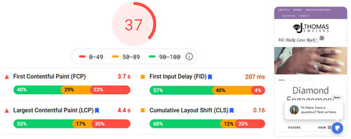
Image optimization isn't the only ingredient in the recipe for calculating pagespeed, but it's one of the biggest. The scores of 0-49 are bad, 50-89 are okay, and 90-100 is the coveted good range.
This test simulated a smartphone. You can certainly see where the pagespeed of 37 falls, which is a big indicator that something is wrong, but we can't blame the responsive design without digging deeper.
Website owners, like yourself, are always concerned about raking higher in Google search results. Your website designer will probably tell you when Google makes a recommendation for improvement, and they make new recommendations at least once every month. Keeping on top of those recommendations is a different story since it usually requires reprogramming, and some type of SEO work.
Not many websites were paying attention to their load times when Google first announced that pagespeed would be included as a ranking factor in 2018. A study in 2019 revealed that the top 10 ranking pages in Google search had a mobile load time of 27 seconds; a follow up study in 2020 showed the top 10 ranking now have a load time of 1.65 seconds.
Remember that the pagespeed score is on a scale of 0-100, so a load time of 27 seconds would land somewhere in the bottom of the scale, while 1.65 seconds would be at the top of the scale.
What does the load time mean to you?
Google gave us this illustration to help you visualize how web visitors react as the page speed increases:
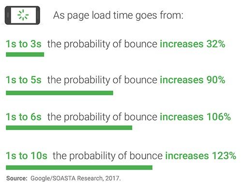
otherwise you'll probably lose a customer.
When a jewelry website design company builds a website from scratch it is very difficult to create something with the fastest load times. Unless you specifically choose a jewelry website platform designed for speed, you're going to end up with a slow website that will need extensive SEO improvements that were not factored into your original website design quote.
If you're considering building a website on your own then you've probably already looked into WordPress, Squarespace, Wix, Weebly, and Shopify. According to this speed study, Weebly and Squarespace were the fastest systems in 2019, with WordPress, Wix, and Joomla at the bottom of the list when using responsive website design.
Before making your final choice on which new jewelry website design company to hire, you should find out what they have to say about the site speed and SEO of the platform they are using. Ask for a demo and do a few speed tests of your own on their latest sites. If their pagespeed scores are in the 0-49 bad range you'll need to ask what it takes to improve that.
What Caused That Score of 37?
The PageSpeed Insights audits about 30 different technical aspects of your website and give you an overview of the problems and a full report of ways to fix them.
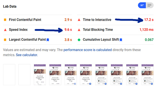
page to load and become usable.
The Speed Index of 9.6s is the amount of time for the page to load on the smartphone screen, which falls into the 123% bounce potential indicated above.
The Time to Interactive of 17.2s is the amount of time for the the mobile page to finish loading fully. This long wait time will likely create a frustrating user experience as they try to touch the screen after 9.6 seconds but the site remains frozen until the load completes.
What Would Cause A Load Time Of 17.6s?
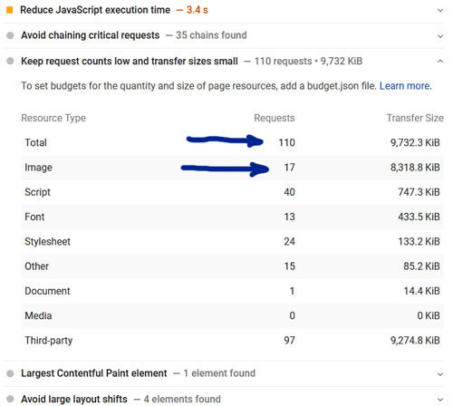
Out of the 30 different technical audits for this site, only 11 passed. Several of the failed audits involve slow loading JavaScripts and computation speeds of CSS files which, are common weaknesses of responsive website design. The biggest issues indicated in the report are the non-optimized images that you see in these two tables.
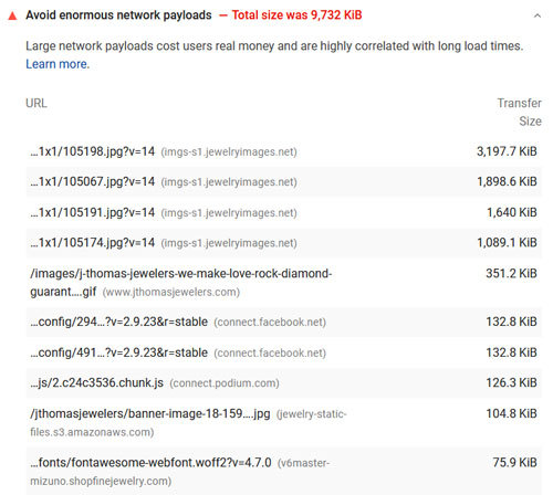
responsive jewelry website design.
totaling 8,318.8KiB, or 8.3MB
The above tables show that there were 110 individual files (requests) needed to make up the mobile responsive site. The total data size was 9,732KiB, or 9.7MB.
Although 9.7MB might not seem like a lot considering the availability of WiFi and 5GE speeds, but when using 4G or even 3G you can see why this would likely create a frustrating user experience for someone casually browsing that site.
How To Solve The Inerrant Responsive Website Design Problem
Google has provided instructions for the latest method of image optimization. These techniques requires you to crop and optimize all of your images for every device, which means you would have a desktop, mobile, and tablet version. The process is known as "Art Direction".
The technique is a pretty awesome solution to fixing the inherent image problem with responsive design. Although this technique has been out for a few years already, it has not been implemented in many of the popular CMS or ecommerce platforms. Your web designer has to put in a lot of manual labor to make it work.
Website design is a very competitive industry because anyone can claim to be a website designer and offer you low prices for an ecommerce website. All it takes is a little knowledge of HTML, a laptop, and experience with Wix, Weebly, or Squarespace. Worst of all, there's a general belief that anyone under 25 years old knows what's best for the internet since they grew up with it. Be wary of jewelry website designers giving you a dirt cheap flat-rate quote for your website, or in-house staff that claim they can build a website in addition to the real job you hired them for.
A good web design company will have a complete mastery of every tiny detail of the platform they are using and an excellent web design company will have the tacit knowledge gained through 15+ years experience of the internet.
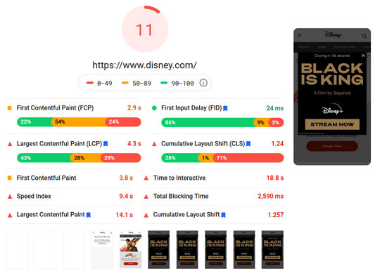
Large companies, like Disney, can afford the staff to correctly implement responsive images and Art Direction, but their website still suffers from other problems that lead to really poor pagespeed scores. As of August 2020 Disney's score is an abysmal 11!
Here's a Recap of What You've Learned So Far
- Mobile websites were originally built as separate, individual websites
- Separate mobile websites fell out of favor due to the difficulty in maintaining a second site
- The responsive website design technique was created in 2010
- By default, responsive websites use the same files for desktop and mobile, but that creates slow loading mobile sites
- Google gave us ways to test an improve website speed to make the user experience better
- Studies show that the top 10 ranked sites in Google have an average load time of 1.65 seconds
- Higher mobile load times lead to higher bounce rates (i.e. lost customers)
- There is a technique to fix the responsive image size problem, but few CMS/Ecom platforms implement it right now, and it requires a lot of extra time
- Website designers without experience and tacit knowledge don't have the skills to create a jewelry ecommerce website that's supposed to make you money
- Large companies have the money to optimize their responsive images, but they often forget about other usability factors
Dynamic Serving Websites and the History That Created Them
The year was 1995 and we were selling computer equipment and "programming" websites one line of code at a time. The internet was the Wild West and every day someone was coming up with a new idea of how to use this technology.
In 1997 we built our first database driven website to sell computers, monitors, servers, Cisco Systems networking devices, and computer parts. That was the birth of what we now call GlitterPaw.
Since we knew a lot about computer hardware we took that into consideration when designing our database structure and all our code. Today, everyone complains about slow loading websites but a fast website back then would load in less than 5 minutes! Time was a big factor and therefore we knew this novel idea for a database driven website needed to be fast.
And it was fast—surprisingly fast.
In 1998, we dabbled with mobile technology for LCD cell phones using the "WAP" language, but we didn't perfect our mobile website technique until 2001 when a new generation of Nokia phones understood HTML.

The .mobi domain name was introduced in the early years of mobile sites to help people recognize sites that were designed for phones apart from the .com sites created for desktops. The mobile sites were small sites with basic contact information and maybe a little bit about the products and services offered.
This is when GlitterPaw gained the ability to identify a different domain name and display a different page, but still allowed those pages to be edited easily together within the same CMS.
In the early days of mobile sites, Google recommended that everyone create a separate mobile website so users would know that those .mobi sites were safe to visit on a phone.
Inspired to Dynamically Serve Content
Microsoft was the early leader in smartphone operating systems with Windows CE available on Nokia, Motorola, HTC, and even "palmtop computers."

from our old marketing.
Using these digital signatures we transitioned from reading a mobi domain name to test user intent to more accurately reading the hardware and redirect users to the correct version of a web page for desktop or mobile.
We called this technique "dynamic content" which later became known as Dynamic Serving.
Around 2010 Google changed their mobile recommendation from using separate URLs to dynamic serving.
Dynamic serving of websites isn't easy, and it takes a level of understanding of hardware that few web programmers were learning any more. In 1997, if you wanted to be a website programmer you also were responsible for owning a web server and hosting the websites you built. By 2010, there were hundreds of web hosting companies and programmers no longer needed to understand hardware. Those programmers were still using separate websites with separate URLs because they didn't have the skills to do better.
When the techniques of responsive website design were introduced in 2010, there was a sign of relief from web programmers because they could concentrate on the look of a website for different screens. "Web programmers" eventually became more accurately referred to as "web designers" because they were using popular systems, like WordPress, to design what a site looked like.
Eventually Google changed their mobile recommendations to endorse responsive web design but not because it's the best choice, oh no, they chose it because they realized the culture of website creation had changed from those with hardware experience to those without hardware experience. Here's the notice from Google's developer site:

We dabbled with responsive website design on a few of the sites we built before 2012, but each of those sites ran over budget and never performed as well as the dynamic serving method we had perfected years earlier.
Ultimately, we've married the two methods. Our strategy involves using one of our jewelry website templates to deliver a finely tuned structure for desktop, mobile, and tablet devices that has responsive abilities to resize fonts.
We've already mastered the ability of delivering the correctly sized images to all three device types and built that feature into GlitterPaw, while also following the UX design principals Google recommends.
With us, there's no afterthought of image resizing, and we don't build websites knowing they have speed flaws that force you to pay more to solve them later.
Therefore, we don't have to worry about the new techniques for Responsive Website Art Direction explained above because we never had that problem to begin with.
Now for the proof...
This is a mobile pagespeed test of one of the jewelry ecommerce websites that we built following our principals to always design for what works.
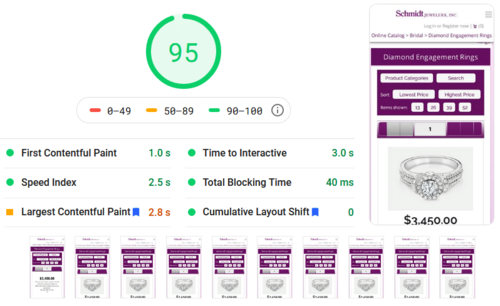
Earlier we explained that scores of 0-49 are bad, 50-89 are okay, and 90-100 is the coveted good range. A score above 90 requires fine tuning of the server hardware, a fast running database, and a fast rendering website structure/template.
We get that fast rendering website structure with dynamic serving far more easily and efficiently than anyone using responsive design.
Here's Why Dynamic Serving Is Faster Than Responsive
With responsive website design your website browser has to do all the thinking after downloading every digital asset for the site. This takes a lot of time. The Disney pagespeed test shown above clocked in at 18.8 seconds to download and complete the process. The other jewelry site shown above clocked in at 17.2 seconds to download and complete.
In our dynamic serving method we fine tune and tweak the mobile and tablet layouts when setting up the site. The browser has very little thinking to do. There's no denying the speed advantage of a layout that does most of the work.
Let's describe it again in jewelry terms...
 The responsive website design is akin to a digital CAD file that you have for a custom design. You can't cast the final ring until you make the mold. How many days does it take for you to make the mold? After the mold is made, and the ring cast, you would destroy it because the mold is only a one time use.
On the other hand, the dynamic serving design is akin to having a mold already made. We created the mold ahead of time for you so the ring can be cast immediately. Once finished we carefully store the mold until the next time it's needed, just like they do for mass produced lines of jewelry.
As per Google guidelines, all the content of the page is the same when viewed on a smartphone, tablet, or desktop, EXCEPT for the images. Google also requests that anyone using dynamic serving include an extra command hidden within the page to let them know the desktop and mobile are different—we take care of that too!
There are some finer points to the comparison of theses sites. The slower responsive jewelry website is loading a header hero image and 8 product images. It's also loading an animated graphic as part of their slogan. Our faster dynamic jewelry website doesn't have a hero image and is only loading 6 product images.
When a website design company sells you a responsive design they will make claims like "your site will look exactly the same on mobile," and "your customers will be satisfied with the similar look and feel from desktop to mobile."
We'd like to present a counter-claim that "customers don't care about your bulky design that's shrunken down and rearranged" because "they only want fast access to products and information."
We really don't believe that it's in your best interest to clog a mobile website with hero graphics or cool desktop features that become tiny on a smartphone.
Our motto is:
"Create mobile sites that can be used one handed while navigating with your big thumb!"
You can't expect consumers to use their smartphone with two hands and therefore you must design a mobile site for one handed use. This is a major tenet of mobile website design that isn't learned without years of mobile website failures. Consider that we've been making mobile sites since 2001 and we have learned a lot from mistakes.
There's nothing worse than having a client cancel their account and accuse you of creating a failing web design! We want our customer to love their website, but at the same time we always apply our years of gained knowledge create something similar to previous sites that worked.
When you look at Google's recommendations for a good mobile site you'll see lots of examples of site usable with one hand and your thumb.
Results of Dynamic Serving of Desktop Websites
Considering this is the age of mobile-first website design it makes sense that we are leaving the discussion of desktop sites until the very end. The Google PageSpeed Insights test shows you the results for the mobile site and the desktop site. Here's the desktop results for the same jewelry ecommerce site we showed you before.

With dynamic serving of website we always expect that the mobile and desktop pagespeed scores will be about the same, but the desktop speed always seems to be higher. A desktop score of 97 is typical for a website using GlitterPaw and dynamic serving. If one of these numbers was vastly different than the other it would be an indicator that the one of the dynamic layouts was not installed correctly.
We should probably mention that, although GlitterPaw is dynamically serving the tablet site to tablet devices, the Google's PageSpeed Insights tool doesn't have a test for tablets. But then again, we are usually years ahead of the technology curve.
Jewelry SEO With Dynamic Serving
It's probably good to mention that the website example we tested has not undergone any SEO improvements, and at the time of the test, the site was running on one of our slower servers that's already 17 months old. Our newer servers have surprised us with sites achieving a score of 99 and even 100!
We're only mentioning this because improvements of your pagespeed score are normally considered to be one of the more expensive jewelry SEO services that other companies sell you after you think your website is complete.
This speed alone will save you from thousands of dollars in expensive SEO fees.
If such an important feature is already built-in to GlitterPaw, can you imagine what other time and money saving SEO features are already included?
What Are Your Thoughts?
We hope you can appreciate the concept, and our implementation of, Dynamic Serving of your website. GlitterPaw continues to evolve with the mission to be the most complete platform you would need for your business.
Development of the platform continues at a regular pace with improvements added when we realize there will be a growing need. We treat our customers like people, not accounts, which means we listen to their business problems and sometimes surprise them with newly developed solutions.
There's a confidence that dynamic serving of websites will eventually be rediscovered by more web programmers as they gain more years of experience and internet servers become easier to maintain. We expect that long pages like this will inspire others to consider the technique.
No website system is perfect for everyone, and we realize that you might still demand a responsive website design even after this long presentation. If that's the case, you will have to choose another jewelry website design company.
If you're ready to have a fast running ecommerce website with many other time and money saving features, then you are ready to give us a call or send an email to get started.